Hi there,
My name is Mike King
I'm a graphic designer based in Melbourne. I have a passion for visual communication and branding with a proven track record of delivering cohesive design projects that resonate with diverse audiences. With 8+ years of experience working as an in-house designer, I deliver reliable, creative, and impactful results.

Victorian Masonic Museum
Freemasons Victoria
LOGO DESIGN | CREATIVE DIRECTION | VISUAL IDENTITY
Freemasons Victoria, the fraternal organisation, was launching a new website for its museum collection and asked me to create a logo that reflected its traditional principles with a modern twist. I took inspiration from the pillars of the ancient world to create this design. The logo features a VMM monogram, using symmetry and negative space reflecting the history and core competencies of Freemasons Victoria.
Sustainability Logo
COLES LIQUOR
LOGO DESIGN
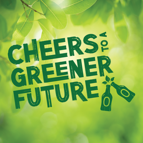
Coles Liquor (Liquorland, First Choice Liquor Market and Vintage Cellars) needed a logo designed for their sustainability stall at a Supplier Showcase. I used a sans-serif font with a paintbrush style across the design to convey a natural and friendly atmosphere. The brandmark of the bottles encompasses both the aspect of socialising with friends and nature.
Grand Installation 'Save the Date' Package
Freemasons Victoria
PRINT DESIGN | CREATIVE DIRECTION | VISUAL IDENTITY
The Grand Installation is the largest and most significant event of the year for Freemasons Victoria. The focus of the 2025 event was 'Welcome to Melbourne', a statement highlighting the beauty and culture of the city. The event attracts thousands of guests from around the globe so it needed a clean design with broad appeal. The roll-out of the 'save the date' campaign included posters, flyers, coasters and tent cards, as well as social media and EDM assets. Using the brand colours I created a wordmark logo and design layout that was easy to replicate across a variety of assets.
The Victorian Freemason Magazine
Freemasons Victoria
PRINT DESIGN | LAYOUT & COMPOSITION
The Victorian Freemason Magazine is a quarterly publication for Freemasons Victoria showcasing the stories of members from around the State. I took over creative control of the magazine in 2020 and since then I have taken the magazine to new levels of success, restoring it to a quarterly publication of 48pp and bringing back advertisers with a brand-faithful design, clean layout and reliable circulation to a global readership.
Mentor Training Course Package
Freemasons Victoria
PRINT DESIGN | CREATIVE DIRECTION | VISUAL IDENTITY
The Mentor Training Course is a key initiative for Freemasons Victoria and it needed a new professional but personable visual identity. Using the brand colours and fonts I created a wordmark for their tagline and striking pattern that could be applied across a wide range of media, including flyers, pull-up banners and web assets. Each asset is visually engaging and aligned with the course's branding, ensuring a professional and inviting presentation. This comprehensive approach not only attracts participants but also reinforces the value of mentorship in personal and professional development.
Annual Report
Freemasons Foundation Victoria
PRINT DESIGN | LAYOUT & COMPOSITION
Freemasons Victoria Foundation is a not-for-profit organisation that donates millions in funding each year to people in need around the state of Victoria. Their annual report needs to not only provide a comprehensive overview of the organization's achievements and financial performance from the previous year but also show the real-life impact their work has on people's lives in the community. l created a dynamic layout to highlight key pieces of information ensuring that the data is easily accessible and visually engaging.
Centenary Logo
The Lodge of the Golden Fleece
LOGO DESIGN | CREATIVE DIRECTION | VISUAL IDENTITY
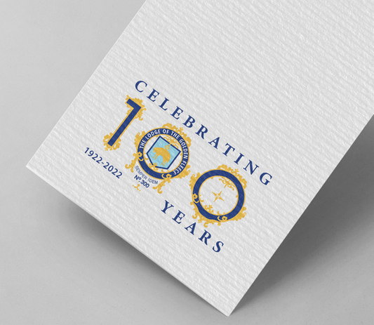
The Lodge of the Golden Fleece is the premier dining Lodge in Victoria with a 100-year history and tradition. Together we created a logo and visual identity to celebrate their centenary year that embodied the sophistication and dignity of the event. The logo lockup utilises key elements of the existing Lodge of the Golden Fleece logo to make it instantly identifiable and incorporates a Serif font that complements the existing design. The result is a logo that is elegant, inviting, and has a regal aesthetic.


